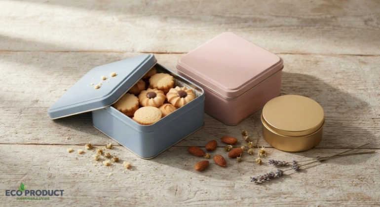
Walk into any gift shop, bakery or beauty boutique this year and you will notice a shift. Dark, heavy packaging is giving way to softer, brighter and more cheerful shades. At the center of that shift are blue and pink tin boxes, a color pairing that feels fresh, friendly and premium at the same time. Whether you sell cookies, candles, skincare or festive gift hampers, the color of your tin can decide whether a customer picks up your product or walks past it.
Tin has always been a favorite packaging material because it is sturdy, reusable and beautiful. What has changed in 2026 is the palette. Brands are moving toward pastel and mid-tone colors that look great on shelves and even better on social media feeds. In this guide, we will look at why blue and pink are trending, how each color affects buyers, where these tins work best and how to choose the right shade for your brand.
Packaging is often the first conversation a customer has with your brand. Before they read a label or check a price, they react to color. That quick emotional reaction is the reason color psychology in packaging has become such a serious topic for small businesses and large retailers alike.
In 2026, three forces are shaping packaging color trends. The first is social media. Products are photographed, unboxed and shared constantly, so a tin that photographs beautifully has a built-in marketing advantage. The second is the growing demand for packaging that customers keep rather than throw away. A tin in an attractive shade becomes a storage box, a jewelry holder or a desk organizer, which keeps your brand visible at home. The third is a general mood shift toward calm, optimistic design. After years of bold neon and stark minimalism, shoppers are drawn to colors that feel gentle yet confident.
Blue and pink fit this mood perfectly. They are soft enough to feel welcoming, but distinctive enough to stand out against the sea of brown kraft and plain white boxes crowding most retail shelves.
Blue has long been associated with trust, calm and reliability, which is why banks, healthcare brands and technology companies use it so often. In packaging, blue tin boxes carry the same quiet authority. A blue tin tells the buyer that the product inside is dependable, clean and thoughtfully made.
Blue is wonderfully versatile. A light sky or powder blue feels airy and modern, which suits skincare, tea, baby products and wellness items. A deeper navy or cobalt feels more luxurious and suits premium chocolates, perfumes and corporate gifts. Because blue is a cool color, it also pairs beautifully with gold or silver foil printing, giving your luxury tin packaging a polished finish without looking over the top.
Another advantage is that blue is gender-neutral. If your customer base is mixed, or you are gifting to both men and women, blue is a safe and stylish choice. You can see how this looks in practice with the blue square tin box, a clean and versatile option that works for everything from cookies to small accessories.
If blue represents trust, pink represents warmth, care and joy. Pink tin boxes have moved far beyond the stereotype of being only for girls’ birthday gifts. Today, pink is used by cosmetics brands, boutique bakeries, wedding planners and even modern lifestyle labels that want a friendly, approachable personality.
The reason is simple. Pink is emotionally inviting. Blush, rose and candy pink shades make a product feel sweet, gentle and special, which is ideal for gifting. A pink tin on a shelf instantly signals celebration, affection and thoughtfulness. In pink tin box packaging, even a small logo or a simple ribbon can make the whole presentation feel like a present.
The pink square tin box is a good example of how a single color can transform an ordinary product into a gift. Fill it with homemade cookies, handmade soaps or festive sweets and the tin does most of the marketing for you.
Individually, blue and pink are strong. Together, they create a balanced, harmonious look that many brands are now building entire collections around. Blue brings calm and structure, while pink adds softness and personality. The result is a pastel combination that feels modern without trying too hard.
This pairing is especially popular for baby showers, gender-reveal events, wedding favors, Eid and festive hampers, and seasonal gift sets. It also works well for brands that want a two-tone identity, such as using blue for their everyday range and pink for limited editions.
Here is a quick comparison to help you see how each color behaves in real packaging decisions:
| Feature | Blue Tin Boxes | Pink Tin Boxes |
|---|---|---|
| Emotional message | Trust, calm, reliability | Warmth, joy, affection |
| Best for | Skincare, tea, corporate gifts, premium food | Cosmetics, bakery gifts, wedding favors, festive hampers |
| Pairs well with | Gold, silver, white, cream | Rose gold, white, mint, gold |
| Audience appeal | Broad and gender-neutral | Strong with gifting and beauty buyers |
| Shelf personality | Professional and refined | Friendly and eye-catching |
Many successful brands do not choose between the two. They offer both, letting customers pick based on the occasion or the recipient.
The popularity of blue and pink is part of a bigger story. Let us look at the broader tin box packaging trends 2026 that are shaping how businesses choose their containers.
Pastel palettes are replacing heavy tones. Pastel tin boxes feel lighter, more approachable and more photogenic. They also age well, because soft colors rarely look dated the way trend-driven neon shades do.
Reusability is a selling point. Customers increasingly value packaging that has a second life. A well-made tin can hold buttons, spices, stationery or jewelry for years. That means your brand lives in the customer’s home long after the product is gone, which is a quiet but powerful form of advertising.
Minimal branding with bold color. Instead of crowding the lid with text, many brands let the color do the talking and add only a simple logo or a single line of text. This keeps branded packaging elegant and makes the tin feel premium.
Mixed collections. Rather than one color for every product, brands are creating small families of colorful tin packaging, such as a blue tin for savory items and a pink tin for sweet ones. This builds a recognizable visual system across the entire product range.
Metal over plastic. As consumers become more aware of plastic waste, metal packaging is gaining ground as a more durable and recyclable alternative. Tin feels substantial in the hand, protects products well and signals quality in a way thin plastic simply cannot.
One reason tin boxes are so popular is how many industries can use them. Here are the most common and profitable applications.
Gift packaging. Tins are a natural fit for tin gift boxes. They feel more special than cardboard, protect delicate contents and can be reused by the recipient. Blue suits corporate and masculine gifts, while pink suits birthdays, bridal events and festive occasions. If you need inspiration, browsing creative gift packaging ideas across your own product range is a smart place to start.
Bakery and food items. Cookie tin boxes are a classic for good reason. Tins keep cookies, biscuits, dry fruits and chocolates fresh, and the sturdy metal prevents breakage during delivery. For bakers also looking at other presentation options, the bakery packaging collection offers complementary products, and the guide on cake boxes for bakery is a helpful read.
Candles and home fragrance. Candle tin containers are everywhere in the handmade candle market. A pastel tin makes a small candle feel boutique and giftable.
Cosmetics and personal care. Lip balms, solid perfumes, soaps and balms look wonderful in small blue or pink tins. The metal feels hygienic and the color communicates the product’s personality instantly.
Tea, coffee and spices. Dry goods benefit from the airtight feel of a hinged lid, and hinged lid tin boxes also make the opening experience more satisfying for the customer.
Events and favors. Weddings, baby showers and corporate events often use small tins as take-home gifts. A matching blue and pink set suits themed occasions beautifully.
Color is only half of the design decision. Shape changes how a tin looks, stacks and feels. Rectangular tin boxes and square tins are space-efficient, stack neatly in shipping cartons and give you a flat lid that is ideal for printing a logo or pattern. Round tins feel traditional, friendly and classic, and they work especially well for candles, creams and cookies.
If you are still deciding, our detailed comparison of round vs square tin boxes walks through the pros and cons of each in practical terms. You can also browse the full range of square tin boxes and round tin boxes to compare sizes and styles side by side.
A helpful rule of thumb is that pink often feels especially charming in a round tin, while blue looks sharp and modern in a square one. Of course, rules are made to be broken, and a pastel blue round tin can look equally lovely.
A colored tin is attractive, but a custom printed tin box is memorable. Adding your logo, brand name or a short message turns an ordinary container into a piece of branded packaging that customers recognize instantly. This is why custom logo tin boxes are so popular with small businesses that want a premium look without the cost of fully custom manufacturing.
When planning custom tin boxes 2026, keep these points in mind:
If you are exploring options for your brand, the tin boxes buyer’s guide explains sizes, uses and what to check before you order, which is especially useful for first-time buyers.
Sustainability is no longer optional for most customers, and packaging is one of the most visible places to show it. Sustainable metal packaging has a strong story. Tin is durable, can be reused many times and is widely recyclable at the end of its life. A tin that gets used for years replaces dozens of single-use boxes and bags.
That said, honesty matters. Tin is not automatically the greenest option in every situation, and the best approach is often a mix of materials. Pairing reusable tin containers with recyclable kraft or paper elements gives you a package that feels premium while keeping waste low. For ideas on building a more responsible packaging mix, take a look at our guides on sustainable packaging solutions in Pakistan and eco-friendly packaging products.
Communicating this to customers also builds trust. A simple line such as “Reuse me” on the inside of the lid encourages a second life for the tin and strengthens your brand’s eco-conscious image.
With so many shades available, choosing can feel overwhelming. The best approach is to think about three things: your audience, your product and your brand personality.
Start with your audience. If you sell mostly to women or to gift buyers, pink gives you an instant emotional advantage. If you serve a broad or professional market, blue is safer and more versatile. If your customer base is varied, offering both is often the smartest move.
Next, think about your product. Sweet, delicate and celebratory items suit pink. Clean, functional or premium items suit blue. Dry foods and tea feel natural in either shade, depending on the mood you want.
Finally, consider your existing brand colors. Your tin should feel like part of the same family as your logo, website and labels. Here is a simple guide:
| If your brand feels… | Consider… | Pair with… |
|---|---|---|
| Calm, trustworthy, professional | Blue tin boxes | Gold or silver foil |
| Sweet, caring, celebratory | Pink tin boxes | Rose gold or white |
| Modern, playful, versatile | Blue and pink tin boxes together | Cream or mint accents |
| Luxurious, classic | Golden or metallic tins with blue or pink accents | Black or white text |
For a luxe alternative or complement, the golden round tin box and square golden tin box pair beautifully with pastel tins in a mixed gift set.
Once you have settled on color and shape, the next step is sourcing. Buying wholesale tin boxes makes sense for businesses because it lowers the per-unit cost, ensures consistency across batches and keeps your packaging available during busy seasons such as Eid, weddings and year-end gifting.
Before placing a bulk order, check the quality of the lid fit, the smoothness of the edges and the consistency of the color. Ask about available sizes so you can match the tin to your product. It also helps to plan ahead, because demand for pastel tins usually rises ahead of festive periods.
If you want to see what is available right now, you can explore the complete tin boxes collection or visit the main shop to view the full range of packaging options. This is a convenient place to compare metal tin boxes and find the right fit for your business needs and budget.
Soft pastels lead the way in 2026, especially blue and pink. Muted blush, powder blue, sky blue and rose tones are popular because they look modern, photograph well and suit many product types. Gold accents remain a favorite for adding a premium touch.
Pink is a strong choice for celebratory and affectionate gifts such as birthdays, weddings and festive hampers, while blue works well for corporate, unisex and premium gifts. Many brands offer both so customers can choose.
Pastel shades feel calm, friendly and premium. They photograph beautifully for social media and appeal to a wide audience without looking aggressive or overly loud, which is why more brands are choosing them.
Yes. Pink tin boxes create a warm, inviting impression and work especially well for cosmetics, bakery items, candles and gift sets. They help products stand out on crowded shelves and encourage impulse purchases.
Neither is universally better. Blue communicates trust and professionalism, while pink communicates warmth and celebration. The best choice depends on your audience, product and brand personality, and many brands use both in one collection.
Custom logo tins are a popular option for small businesses because they make packaging look more premium. It is best to discuss your design, quantity and size requirements with your supplier before placing an order.
The rise of blue and pink tin boxes in 2026 is not just a passing fad. It reflects a real shift toward packaging that is beautiful, reusable and emotionally engaging. Blue brings trust and calm, pink brings warmth and joy, and together they create a flexible palette that suits gifts, food, cosmetics, candles and events.
If you are a brand owner, the takeaway is simple. Choose a color that matches your audience and personality, keep your design clean, think about the tin’s second life in your customer’s home and source from a supplier who values quality and consistency. A well-chosen tin does far more than hold a product. It tells your brand story every time it is opened, displayed or reused.
Explore our blue square tin box and pink square tin box, or browse the full tin boxes collection at EcoProduct.pk. Contact our team today to discuss your bulk requirements and give your products the stylish look they deserve.

Author at Eco Product — passionate about sustainable living and eco-friendly products.

Subscribe our newsletter & get notification about information discount.
Subscribe to get special offers, free giveaways, and once-in-a-lifetime deals.